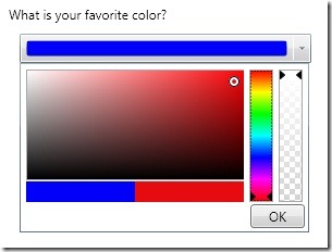
If you are using the Extended WPF Toolkit you have probably noticed the ColorPicker control. If you are not familiar with the Color Picker control, it is simply a WPF editor control that allows a user to select a color. If you are using release version 1.2 or less the color picker will look something like this:
At first glance it looks like it has the functionality needed to choose colors, it even looks nice. Your user can even change the transparency of the color by using the alpha slider. Just what your users need right?
Well, after some very good feedback, it seems that users don?t like constantly searching for the same color. Actually, even if they could manage to get close to the same color, it will most likely not be the exact same color. It can also be time consuming to find the right color, you have to change the hue, then move the pointer around on the canvas, and then change the transparency if needed.
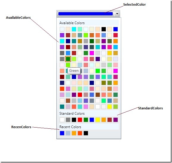
It is because of these usability issues that I have completely redesigned the ColorPicker control. It now looks like this:
As you can see, the control has been simplified, but with simplification comes more features. The ColorPicker is now made up of three sections; Available Colors, Standard Colors, and Recent Colors. By default, there are 140 available colors and 10 predefined standard colors. You can use your own custom color palettes by setting the AvailableColors and StandardColors properties accordingly. You can also get/set the recently used colors by using the RecentColors property.
This new and improved ColorPicker control is only available through the source code download until the 1.3 release. So go get the source, play with it and let me know how you like the improvements.


Honestly, (without looking at the code) you need both versions in one to satisfy any true creative type.
@Eddie Garmon
Yes, I agree. There are plans to add the custom color palette to the control soon. The immediate need was for a simpler way to interact with colors. The will eventually be a “More Colors” button, which when click will show the advanced color picker.
This is a horse that has been beaten to death. The trouble with the original colour picker is that it’s difficult to reproduce colours. The trouble with your new suggested picker is that the colours are all over the place.
Some time ago someone came up with the idea of using a colour honeycomb, and from what I can see Microsoft has patented it. It groups colours by hue in a fraction of the screen real estate.
There are a few variations of it, but for a rough idea:
http://img.sharewareplaza.com/soft/25406/colorpic-1.jpg
@Steve Py
WPF doesn’t have an original color picker, but I know what you mean. With my color picker you can choose what colors to have and in what order they appear, what you see is just the default implementation. I know of the honey comb approach you mentioned, and no Microsoft didn’t patent it. Several third party control vendors actually use the honey comb approach in there advanced color editors. You have the same problems with the honey comb approach that you do with the advanced color picker. The user has to do more work to find the color they want. In most cases users want a predefined set of common colors, so they don’t have to worry about hue or color varianats, they just want blue. In advanced scenarios the honey comb would be useful, but that it not the problem this color pick tries to solve.
I’d also like the possibility to choose between the old and new layout.
(Our users have to be able to edit the alpha value in a transparent way.)
Otherwise: Great work, thanks a lot!
selection via keyboard is not working? is there any idea?