It?s that time again. Time for another release of the Extended WPF Toolkit. I know it?s only been three short months since the last release, but this release is packed with 11 new controls as well as many bug fixes and updated controls. I have been working hard to provide the WPF community with a full set of controls to meet the most common control needs. So let?s look at the newest members of the Extended WPF Toolkit family.
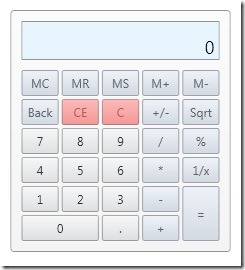
Calculator
The Calculator is a control used for performing mathematical calculations.
It provides basic math functions, memory functions, as well as mouse and keyboard support.
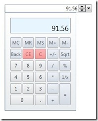
CalculatorUpDown
The CalculatorUpDown provides a TextBox with button spinners that allow incrementing and decrementing numeric values by using the spinner buttons, keyboard up/down arrows, or mouse wheel. It also provides a Calculator dropdown which allows you to perform mathematical calculations.
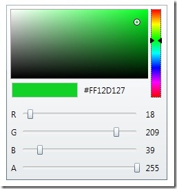
ColorCanvas
The ColorCanvas allows you to select a color either using an advanced color canvas, by setting the HexadecimalString, or by setting the ARGB values. This control has also been merged with the ColorPicker to provide advanced color editing abilities.
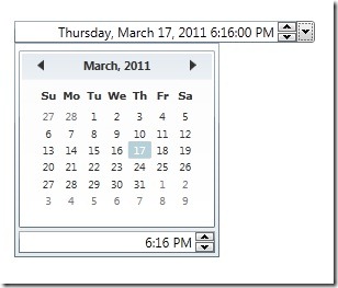
DateTimePicker
Get the best of both worlds. The DateTimePicker provides a DateTimeUpDown control as well as a dropdown with a calendar and a TimePicker.
DecimalUpDown
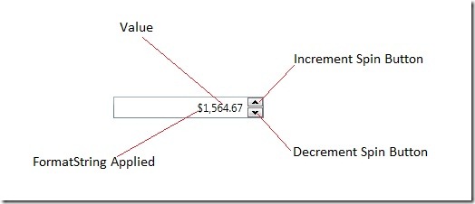
The DecimalUpDown control provides a TextBox with button spinners that allow incrementing and decrementing Nullable<Decimal> values by using the spinner buttons, keyboard up/down arrows, or mouse wheel.
When using the DecimalUpDown in data binding scenarios, bind your object’s value to the Value property. You can specify how much to increment the value by setting the Increment property. You can control the minimum and maximum allowed values by setting the Minimum and the Maximum properties. You can also specify if the user can directly edit the values in the text box by setting the IsEditable property. If you would like to get the actual fromatted string representation of the value, you can use the Text property.
DoubleUpDown
The DoubleUpDown control provides a TextBox with button spinners that allow incrementing and decrementing Nullable<Double> values by using the spinner buttons, keyboard up/down arrows, or mouse wheel.
IntegerUpDown
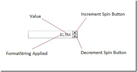
The IntegerUpDown control provides a TextBox with button spinners that allow incrementing and decrementing Nullable<int> values by using the spinner buttons, keyboard up/down arrows, or mouse wheel.
PropertyGrid
The PropertyGrid is a pure WPF replacement for the WinForm PropertyGrid control. Currently the PropertyGrid is in beta and still has a lot of work to be done on it. But it is ready from simple use and testing.
SplitButton
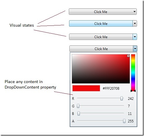
The SplitButton control is a button that can be clicked and also provides a drop down in which you can place any custom content within.
TimePicker
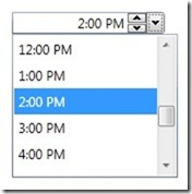
The TimePicker is a control that is specifically for the Time portion of a DateTime property. It provides a ButtonSpinner as well as a list of times to choose from. You can also manually type in the time as long as it matches the specified format.
WatermarkTextBox
The WatermarkTextBox is simply a TextBox that allows you to sepcify an object, usually a String, to represent null or missing text. Don?t think you are limited to just text! With this control you may use any object as a watermark. Here is an example using an image with text:
Also, all input controls in the Extended WPF Toolkit now provide a Watermark option.
That?s it for the new controls. I hope you enjoy version 1.4.0 and be sure to report any bugs or request new features in the Issue Tracker. As always if you have any questions be sure to ask them in the Discussions.

My problem with the color picker is the color (#FFF2070B) is not selectable or unable to copy to the clipboard.
Great sets of controls, keep up the good works!