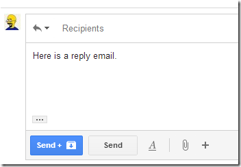
I?ve started noticing more details of UX design in the software I use on a daily basis. Recently I noted an example of reducing a two-click flow to a one-click flow. Note the blue button on my Google email.

Before this Send+ button existed, only Send appeared. I would hit Send on the reply, then I would very often hit Archive as the next click. I bet:
- Lots of other people clicked that sequence.
- The right person at Google asked, ?What are the most common command sequences we find in GMail usage??
- That person then pushed on the question until the answer was found.
- Once the question was answered, someone took action.
Now clicking the Send+ version combines the Send and Archive commands into one. What a pleasant and simple little improvement.
This is impressive as hell to me because it shows a level of nuance and detail found in truly well-engineered systems, both software and human, capable of producing such a pleasant little improvement.
What are some examples of small niceties in UX you have noticed or can suggest?
Yeah, I love this feature. It has been available through GMail Labs for a couple years.