Prism Commands enables you to handle user interactions in Xaml. Even though the plumbing is there, Prism lacks commanding support for everything but Buttons. Fortunately, it?s relatively easy to create new Commands for a range of controls. This post details how to create a Checked and UnChecked Command for the ToggleButton (which can be applied to a RadioButton and a CheckBox).
Recently I had a need to create a Checked Command for a ToggleButton. There are many sources on how to create a Command, the best one probably being Erik Mork?s video, but there wasn?t a place to grab the a Command from. The intention of this post is to share the Checked and UnChecked Prism Commands for you to use it in your project. (Moving forward, it might make sense to create a repository of these Commands.)
Finally, before diving in, if you just want the code and to see an example, follow these links:
Commands
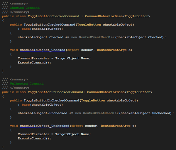
Creating the Commands is straight forward. Derive from CommandBehaviorBase and specify the type. Then, in the constructor, register the event. Below are both the Checked and UnChecked commands.
Extensions for Xaml
After creating the Commands you need to create Static methods to reference in Xaml. The Static methods are named Checked and UnChecked. They include a definition for:
- SelectedCommandBehaviorProperty
- CommandProperty
- SetCommand
- GetCommand
- OnSetCommandCallback
- GetOrCreateBehavior
In an effort to be brief I have chosen to truncate the two static methods. To take a closer look at the code, click on the image or download the code.
Hooking everything up
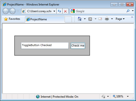
After the Commands are created, bind them to the ToggleButton in Xaml. In this sample application there are three main files:
- MainPage.xaml ? the presentation. This contains the binding to the Commands.
- MainPage.xaml.cs ? the primary function of the code-behind is to new up the MainPageModel and set the DataContext.
- MainPageModel.cs ? this is the model for the MainPage. It defines the commands the Xaml binds to as well as a property for the TextBox to bind to.
Below are images of the classes mentioned above:
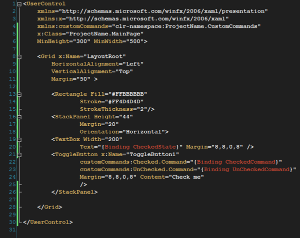
MainPage.xaml
Note in this Xaml, line 20 binds to the CheckedState property in the MainPageModel. The commands are bound on line 22 and 23. Take notice of the namespace command. Instead of referencing Microsoft.Practices.Composite.Presentation.Commands it references ProjectName.CustomCommands.
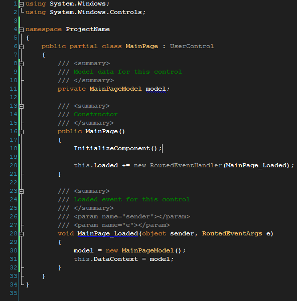
MainPage.xaml.cs
This is the code-behind for the above UserControl. On the Loaded, a new instance of MainPageModel is initialized and then set as the DataContext to the UserControl. The heavy lifting is done in the MainPageModel.
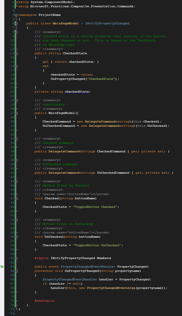
MainPageModel.cs
As noted above, the MainPageModel does the heavy lifting. The following describe what happens in this file:
- Two DelegateCommands are defined for Checked and UnChecked. (line 36 and 41)
- A Property called CheckedState is defined and fires the PropertyChanged event when updated. (lines 13 ? 22)
- Two methods are defined to handle the actions on the Commands. (lines 47 ? 59)
2 thoughts on “ToggleButton Command for Prism”